
The Hidden Cost of Looking Like Everyone Else…
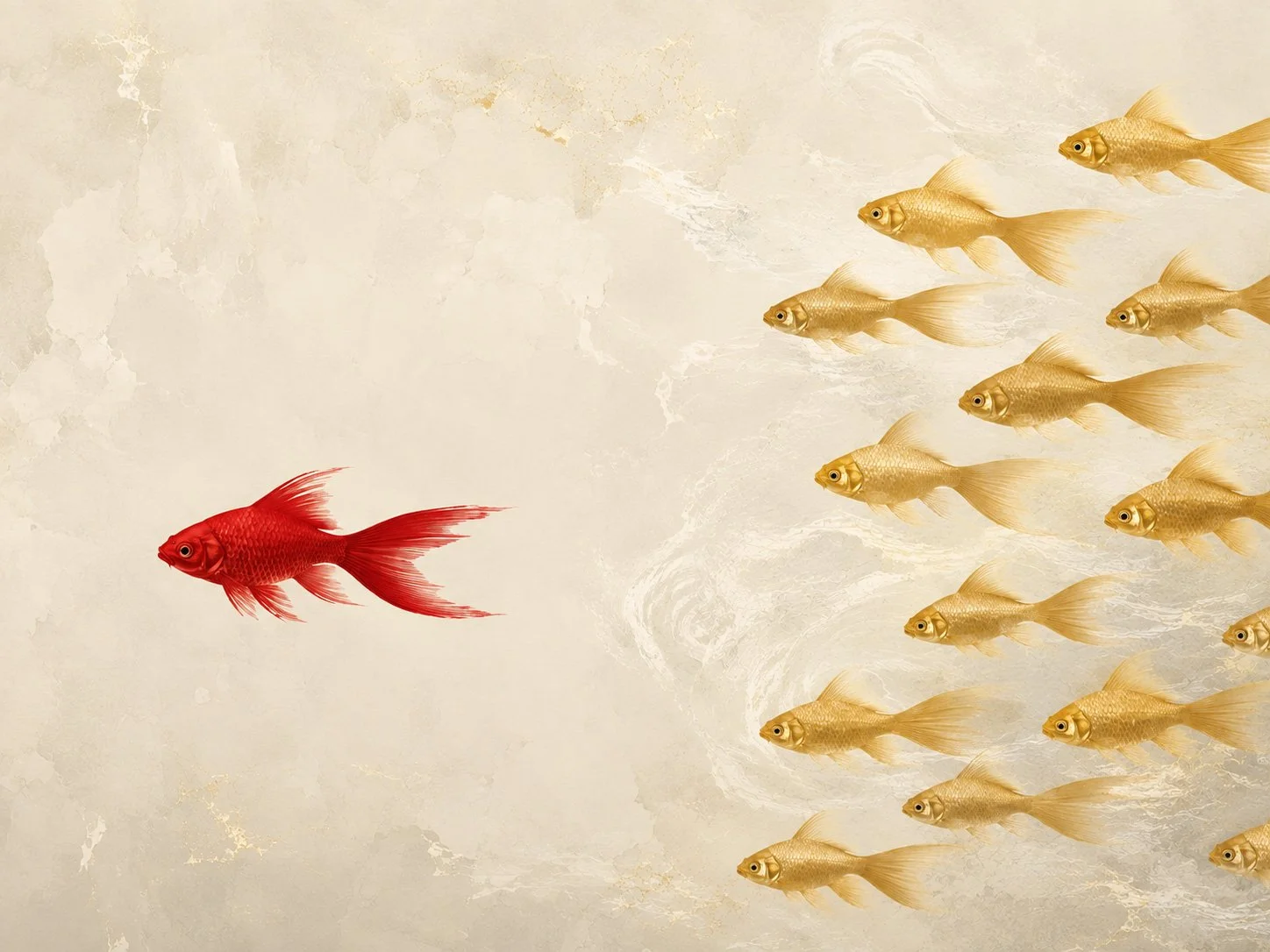
Templates make design easier.
They can also make brands disappear.
Scroll through LinkedIn or Instagram for a few minutes and certain things start to look very familiar. The same fonts, the same pastel blocks, the same little geometric flourishes. Different company, different logo, but somehow the same look.
DIY design tools have made it incredibly easy to produce something that looks clean and presentable. That’s useful, but it has also created a problem for brands trying to stand out. When everyone has access to the same shortcuts, everyone starts to look remarkably similar.
Good design is about more than making something tidy. It’s about knowing what matters, what needs to stand out, who you’re speaking to and what kind of impression you want to leave.
When everything starts to look the same
Templates have to be generic. That’s why they work. A layout needs to be flexible enough for a bakery, an accountant, a gym or a software company to pick it up and make it useful with a few changes.
That convenience comes with an obvious drawback. If everybody has access to the same library, everybody has access to the same visual shortcuts, and over time brands start to lose some of their individuality. Typography, colour, image style and layout become less about the business and more about whatever happens to be fashionable in the template collection.
The result can look perfectly respectable, but respectable and memorable are not the same thing. You cannot disrupt an industry if you’re wearing its uniform.
Neat isn’t the same as distinctive
Good design is about more than making something tidy. It’s about knowing what matters, what needs to stand out, who you’re speaking to and what kind of impression you want to leave.
That might be expressed through typography, photography, colour, layout or simply the way information is organised. Used consistently, those decisions become recognisable, to the point where someone can know a piece of communication is yours before they have even seen the logo.
That’s where brand identity starts to earn its keep. A pre-made template can give you a competent layout, but it can’t understand why your business should look the way it does.
Canva makes design easier. It doesn’t make everyone a designer.
Canva is useful because it removes a lot of friction from producing everyday graphics, but that convenience can also disguise the difference between assembling something and actually designing it.
A template can give you a layout, a colour palette and a type pairing in seconds. What it can’t give you is judgement: knowing when to break the grid, when something feels off-brand, how far you can push an idea, or how that piece fits into a wider visual identity.
That’s where experienced design earns its keep. The software can speed up production, but it shouldn’t be mistaken for the creative thinking behind it.
AI-generated artwork brings a slightly different problem. It can produce impressive imagery very quickly, but restraint isn’t always its strongest suit. Without a clear creative hand there’s a tendency towards visual excess: more detail, more drama, more polish, more of everything, until the original idea starts disappearing underneath it all.
Or, to put it another way, you can’t see the rococo wood for the rococo trees.
Knowing what to leave out is just as important as knowing what to put in. A strong concept often needs less, not more, and that judgement still comes from the person directing the work.
And then there’s print
Something can look absolutely fine on screen and still cause problems when it goes to print.
RGB colour does not always translate neatly into CMYK, particularly with brighter colours, and knowing where that conversion is likely to cause problems is part of preparing artwork properly. The same applies to image resolution. Something that looks sharp on a laptop or phone might contain nowhere near enough information to reproduce cleanly at the size it needs to be printed.
Then there are the less glamorous parts of the job: bleed, trim, safe areas, overprint, ink coverage and making sure the artwork has actually been supplied correctly. None of these things are especially exciting, but they matter.
“He who pays cheaply pays twice” is something we say a lot at Wodehouse. A bargain starts looking rather less attractive when artwork has to be rebuilt, colours need correcting, images need replacing or, worst of all, a print job has to be run again. Saving money at the design stage can simply move the cost further down the line, usually with considerably more hassle attached.
A brochure with text sitting too close to a trim edge, an image that falls apart when printed or artwork supplied without bleed can suddenly make the cheap option look rather less cheap. Design has to work when it leaves the screen, not just while it’s sitting on one.
The real cost of blending in
DIY design feels inexpensive because there is very little upfront cost, but the harder thing to put a price on is being ignored.
If your advertising, social posts or marketing materials look much the same as everyone else’s, there is less reason for anybody to stop and notice them. That doesn’t mean everything has to be wildly original or clever for the sake of it. Some of the strongest identities are extremely simple; they just feel as though they belong to the business using them.
There will always be a place for quick graphics, internal notices and everyday content, but the things that define how your business is seen, from your website and campaigns to printed material and your overall visual identity, deserve a little more thought than whichever template happened to come up first.
Build the brand first, then choose the tools that help you express it.
Making content has become incredibly easy. Being recognisable hasn’t.
If your brand is starting to look a little too much like everyone else, talk to Wodehouse Marketing. We can help you create something that actually feels like yours.
We love good design and aesthetics and don't feel it should cost the earth either. Across all areas of business and the charity sector Wodehouse have delighted our clients with graphic design, high quality print and direct mail solutions since 2003.