
Working Backwards from Reality
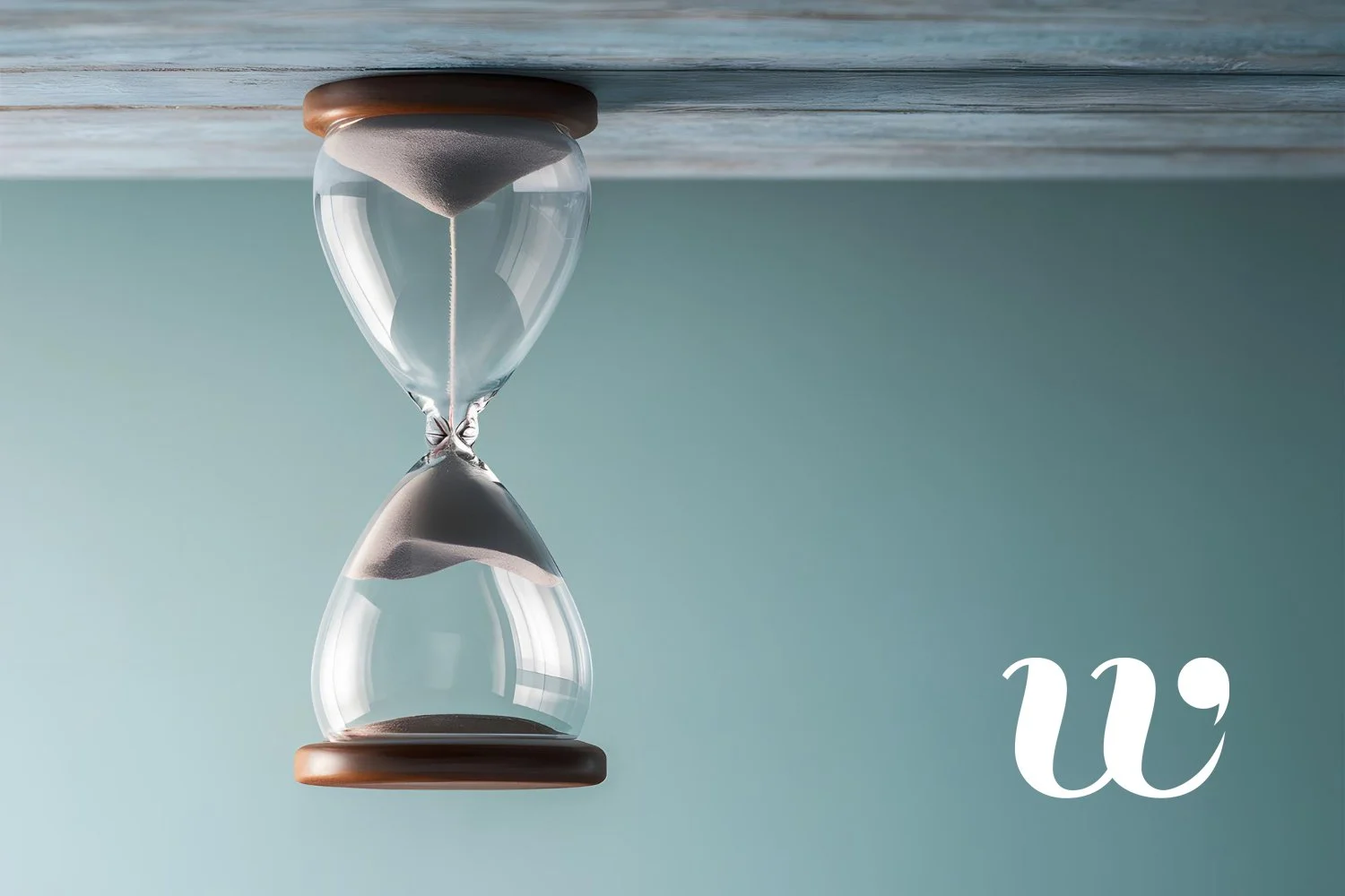
There’s a lot to be said for working backwards from the brief, you can see the future!
Good design often looks simple, but that simplicity is usually the result of quite a lot of thinking before anything appears on the page.
A logo sits comfortably in the corner, the colours feel right, the typography seems effortless and a brochure, website, exhibition stand or social post all feel unmistakably part of the same organisation. None of that happens by accident.
Before a designer starts producing anything, there are questions to answer. Where is the brand manual? What colours have been specified, and do they work equally well in print and online? What does the typography say about the organisation? Is the brand supposed to feel established, efficient and authoritative, or smaller, warmer and more personal? Who is the audience, what are we trying to communicate and, just as importantly, what is the budget?
A good designer doesn’t treat every new brief as a blank sheet of paper. They look at the existing brand, understand the rules and, more importantly, understand why those rules exist in the first place.
Consistency matters because every piece of communication contributes to the impression people form of an organisation. If a website feels warm and approachable but the printed material suddenly looks stiff and corporate, something jars. That doesn’t mean every piece has to look identical, though. Good design is not about repeating the same layout forever; it is about knowing how far a brand can stretch while still remaining recognisable.
Colour is a good example. A bright shade that looks fantastic on screen may behave very differently in print, so a designer has to think about RGB and CMYK, accessibility, contrast and how those colours will perform across a wide range of applications. Will they still work on an exhibition panel, a photocopied form, a cheap office printer or a screen viewed in bright sunlight?
And sometimes the most important question is much simpler: will the logo still work in one colour?
Sooner or later somebody may want it screen printed onto a bag, embroidered onto a fleece, cut from vinyl, laser etched or reproduced somewhere that simply doesn’t allow the luxury of a carefully managed full-colour palette. A good identity should survive that without falling apart.
Typography carries just as much meaning. A clean, structured typeface might suggest efficiency, planning and confidence, while something softer and less formal can feel more personal, approachable and human. Neither is inherently better. It depends entirely on the organisation and the impression it needs to create.
A national organisation may need to feel authoritative and reassuring, while a smaller local one may need to feel much closer and more personal. A fundraising campaign may need urgency without becoming alarming. A designer’s role is to understand what the organisation wants to say and make sure the visual language is saying the same thing.
Then there is the real world, where budgets, production methods and practical limitations tend to spoil beautifully theoretical ideas.
Good designers work backwards from reality.
A design that only works with expensive finishing techniques isn’t particularly clever if the budget won’t support them. Good designers work backwards from reality. How will this be printed? How many are being produced? Will the material need regular updating? Can the organisation reproduce parts of it internally later? Will the same idea need to work across print, web, signage, email and social media?
Scale matters too. A logo that looks wonderful across the front of a presentation may turn into an indecipherable blob when reduced to the size required for a pen, badge or social-media avatar. Equally, an identity that works beautifully on a letterhead may one day need to appear three metres wide across an exhibition stand.
That is why good design is rarely just about solving the immediate brief. An experienced designer is often thinking about the thing that has not been asked for yet.
What happens when somebody wants the logo embroidered onto clothing? What happens when a landscape campaign suddenly has to become a square social-media post? What happens when a carefully composed leaflet needs another 200 words of mandatory copy? What happens when the person producing something internally doesn’t have access to the original font?
Nobody can predict every future requirement, but good design allows for enough flexibility that a brand can adapt without losing itself.
There are now plenty of tools that can help organisations maintain consistency. Templates can do it, design systems can do it, and AI can increasingly do it too. All of that is useful.
But consistency is only part of the job.
Design also depends on judgement, and that is harder to reduce to a set of rules. It is the ability to recognise when something technically follows the brand but still feels wrong; when a layout is becoming too busy; when a colour combination is weakening rather than strengthening the message; when an image feels generic rather than genuine; or when one more element will simply make the whole thing worse.
It is also knowing when to stop. We save clients money in their futures.
Technology can generate options very quickly, but more options do not automatically lead to a better result. Experience helps narrow them down, discard what doesn’t work and recognise when a piece of communication is doing exactly what it needs to do without unnecessary decoration.
That judgement sits alongside all the practical questions of cost, production, scale and consistency. Together, they are what turn a design from something that merely looks right into something that actually works.
And ultimately, that is the job: not just to make things look good, but to make sure they survive contact with reality.
We love good design and aesthetics and don't feel it should cost the earth either. Across all areas of business and the charity sector Wodehouse have delighted our clients with graphic design, high quality print and direct mail solutions since 2003.