
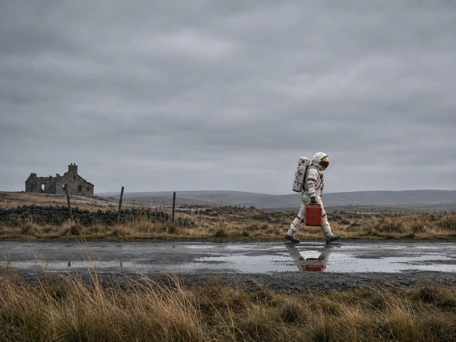
A bit of stellar thought shouldn’t make you feel earthbound.
Why charities shouldn't be afraid of a good idea
Charities exist to make a difference. Yet when it comes to communicating that difference, many seem remarkably reluctant to take creative risks.
The result? A familiar procession of earnest photography, predictable headlines and worthy messages that, however well-intentioned, struggle to stand apart.
Of course, charities have reputations to protect, trustees to satisfy and supporters to reassure. But when caution becomes the overriding consideration, creativity can become the first casualty.
And sometimes the greater risk is being ignored.
Here are three examples of charity communications that demonstrate what happens when a strong idea is given room to breathe.
Changing Lives. Changing Lines.
Sometimes the cleverest ideas begin with something entirely familiar. A proposed awareness campaign for UK charity Changing Lives takes the visual language of the London Underground map and transforms it into a powerful illustration of homelessness, addiction and domestic violence.
Each poster charts two possible journeys through life. One follows an increasingly desperate path towards an uncertain future. The other introduces the charity as an interchange station, where intervention changes the direction of someone's life.
The brilliance lies in the simplicity of the metaphor. We recognise the visual language immediately, yet never mistake it for an actual route map as the familiar curves of the tube map are now rectilinear. Two journeys, two possible destinations, and one crucial opportunity to change direction.There's no need for distressing photography or an emotionally manipulative appeal. The design communicates both the problem and the charity's purpose with remarkable intelligence.
It's a reminder that audiences don't always need to be told what to feel. Sometimes they simply need to be given something worth thinking about.
The campaign was conceived by designers Stacy Agius and Katie Harbord as an early conceptual project in their design careers, and it's refreshing to see such bold, intelligent creative thinking. Although not a commissioned campaign, work like this demonstrates the value of a genuinely fresh perspective.
It's exactly the kind of imaginative approach the charity sector should be encouraging. An idea that respects its audience, communicates a difficult subject with sensitivity and makes you stop and think.
“A moment that Alzheimer's will never forget.”
Seven words. One extraordinary headline.
Created by New Commercial Arts for Alzheimer's Society, this newspaper advertisement celebrated the announcement of lecanemab, a significant development in research into treatments for Alzheimer's disease.
The headline is arresting precisely because it contradicts the devastating effects of the condition itself. But there's more happening here than clever wordplay.
It acknowledges the disease, celebrates scientific progress and offers an implicit thank-you to the supporters whose generosity helps make research possible.
And the execution? Just blue typography on a largely empty newspaper page. No sentimental photograph. No elaborate illustration. Nothing competing with the idea.
Produced and placed within 24 hours of the announcement in 2022, it's also a wonderful example of creative responsiveness.
As we always say at Wodehouse - Sometimes great design is simply knowing when to stop.
Blood Cancer UK. A brand with heart.
When Pentagram, led by Marina Willer, developed the identity for Blood Cancer UK in 2020, it created something far more valuable than a recognisable logo.
At its centre is a hand-drawn letter B, subtly shaped like a heart. Rather than remaining a conventional signature at the bottom of an advertisement, the symbol becomes part of the charity's visual language, working alongside photographs of people, families and relationships.
It's an identity that does more than announce who's speaking. It helps communicate what the organisation stands for: love, connection, care and support.
The beauty of the approach is that the branding and emotional message become inseparable. The symbol isn't simply applied to the communication; it participates in it.
It's a particularly elegant demonstration of how a coherent identity can become a powerful storytelling tool.
The courage to be different
What connects these three examples isn't extravagant production, deliberately provocative imagery or enormous advertising budgets.
It's confidence in the underlying idea. Changing Lives trusts its audience to follow an intelligent visual metaphor. Alzheimer's Society trusts seven words to deliver an emotional message. Blood Cancer UK allows its identity to become an expressive part of the story.
Each approach is different, but all three demonstrate that creativity and responsibility are not mutually exclusive.
Being bold doesn't mean being reckless. And being sensitive to a cause doesn't mean every communication has to look and sound like every other charity's. Effective creative work starts with understanding the audience, respecting its intelligence and finding a compelling way to communicate something that matters.
Because ultimately, the safest thing a charity can do isn't necessarily to play safe. It's to make sure its message is remembered.
Find out more about these great campaigns…
Explore the creative thinking behind the three campaigns featured in this article.
At Wodehouse Integrated Marketing, we believe thoughtful strategy and confident creativity belong together. From brand development and fundraising campaigns to direct mail and print, we help organisations communicate with clarity, purpose and impact.